NIMBUS This has been updated with a new look
by Shane Gunnell / Singletrack
Usual Client Timeline - 3 Months
Nimbus is Singletrack's standard portal offering that is used to demo to potential clients the general stock-standard feel & capabilities that can be provided as a service.
In short, it's a FinTech portal that houses customer research.
Originally it was just a bare-bones setup - some data here, some tables there. Nothing else really going on.
Based on feedback, industry market research, and general state of modern design - we came to the conclusion that a visual-overhaul was required. Our web-app served it's purpose, but it wasn't serving it as best it could. We decided to kick it up a notch and create an easier, more pleasant experience for the users.
By adopting a general "App" feel throughout the product, the users journey through all platforms and devices should remain the same. Any external sites would sit in the normal top-site navigation menu, and any internal will sit within the sidebar. A simple colour palette was used to keep it clean and minimalistic, thus showcasing the content - not the app itself.
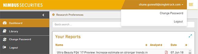
DASHBOARD
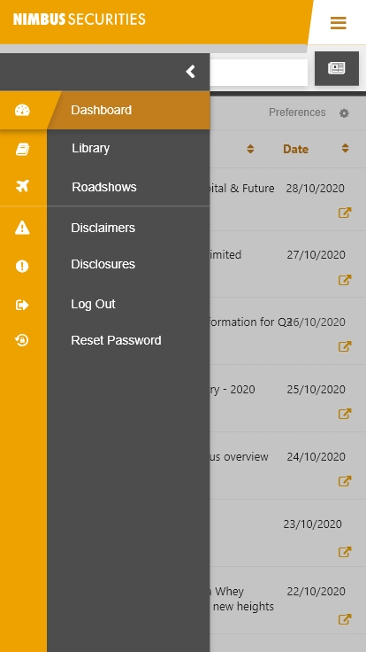
By adopting the use of a side navigation bar that houses anything directly related to the portal main content frame, the users have a central point of references when searching for on-site portal navigation. Any time this sidebar is minimised or maximised, the portal will apply an expand / contract animation - and the portal will animate itself outwards to facilitate the new size. This bit of animation is meant to act as a reinforcement that the portal is slick, fast, and easy to use. There are also subtle hover-over colour shift animations on the navigation pills, once again driving home the smooth feel.
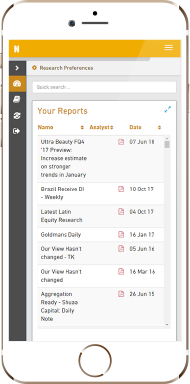
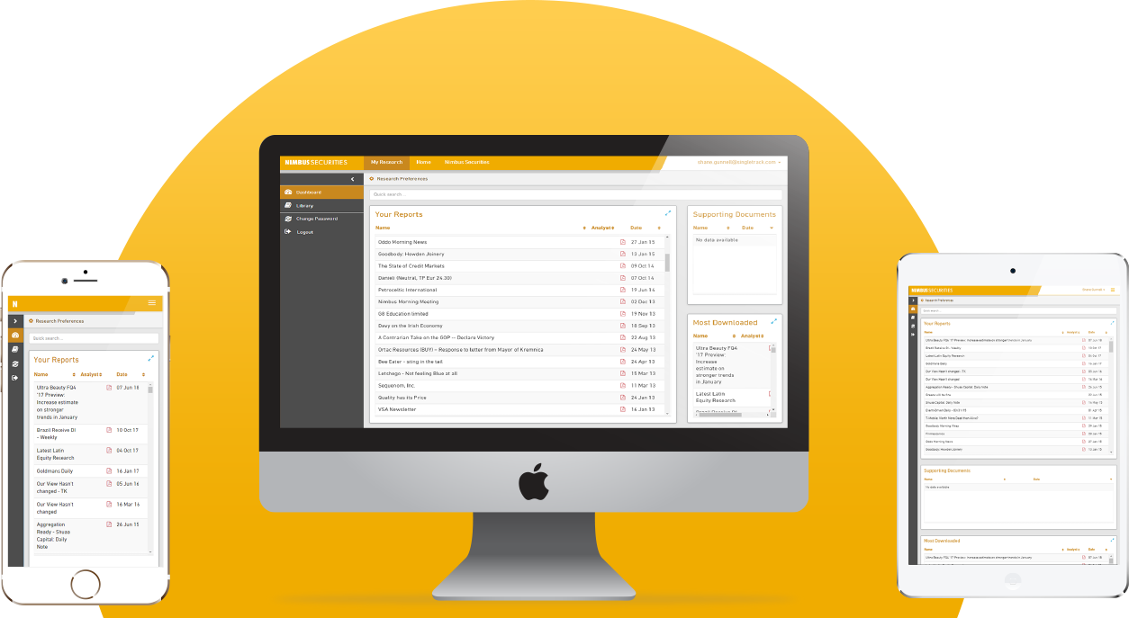
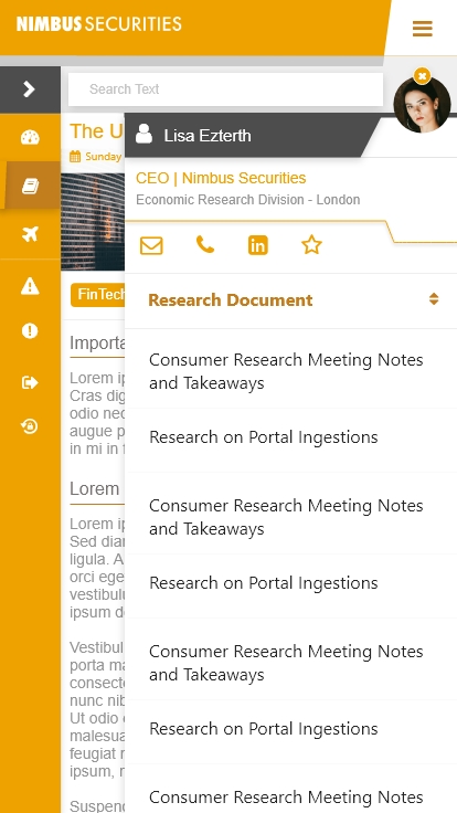
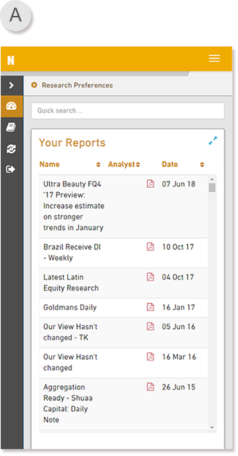
Dashboard Image A) An example of how the product looks like when on Mobile.
It is fully functional and responsively scales down quite well. It still retains the brand flavour and general appearance, thus the user is not impacted too much on their journey between devices as there’s nothing more frustrating than having to learn different device products even though they should be the same thing.
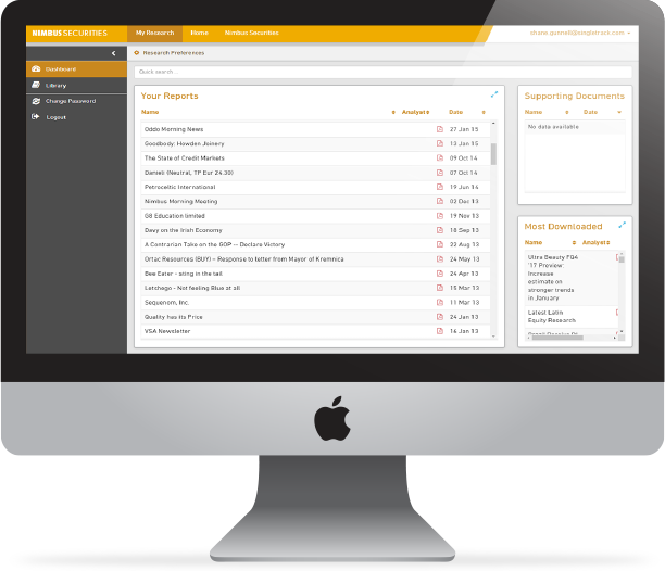
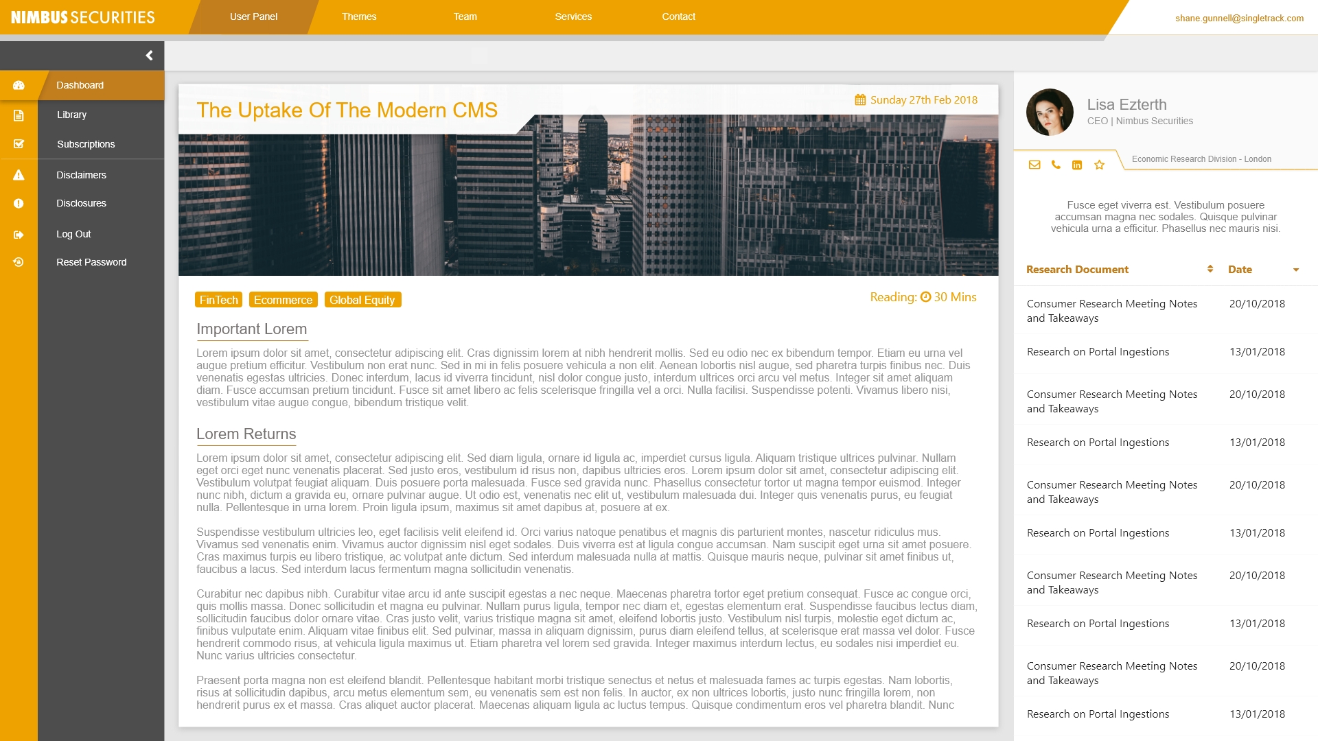
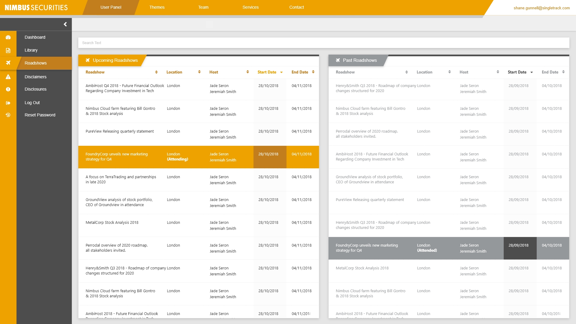
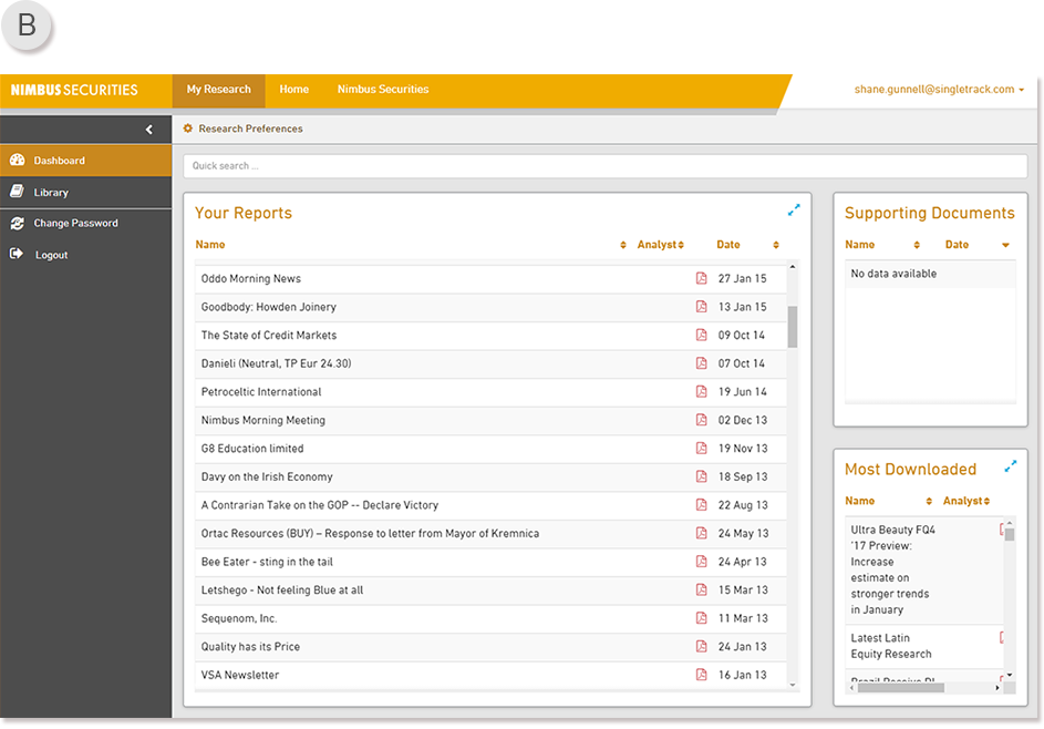
Dashboard Image B) An example of how the product looks like when on Desktop.
By maximise the use of space, and giving it a textured feel with the use of multiple shades of grey (thankfully not too many shades of grey, if you know what I mean), the user is not left with gaps of unstyled missing content. The username is displayed at the top right so that people are aware who they are logged in as, and if they are used to the traditional logging out from clicking on the username - there are log out / change password buttons inside.
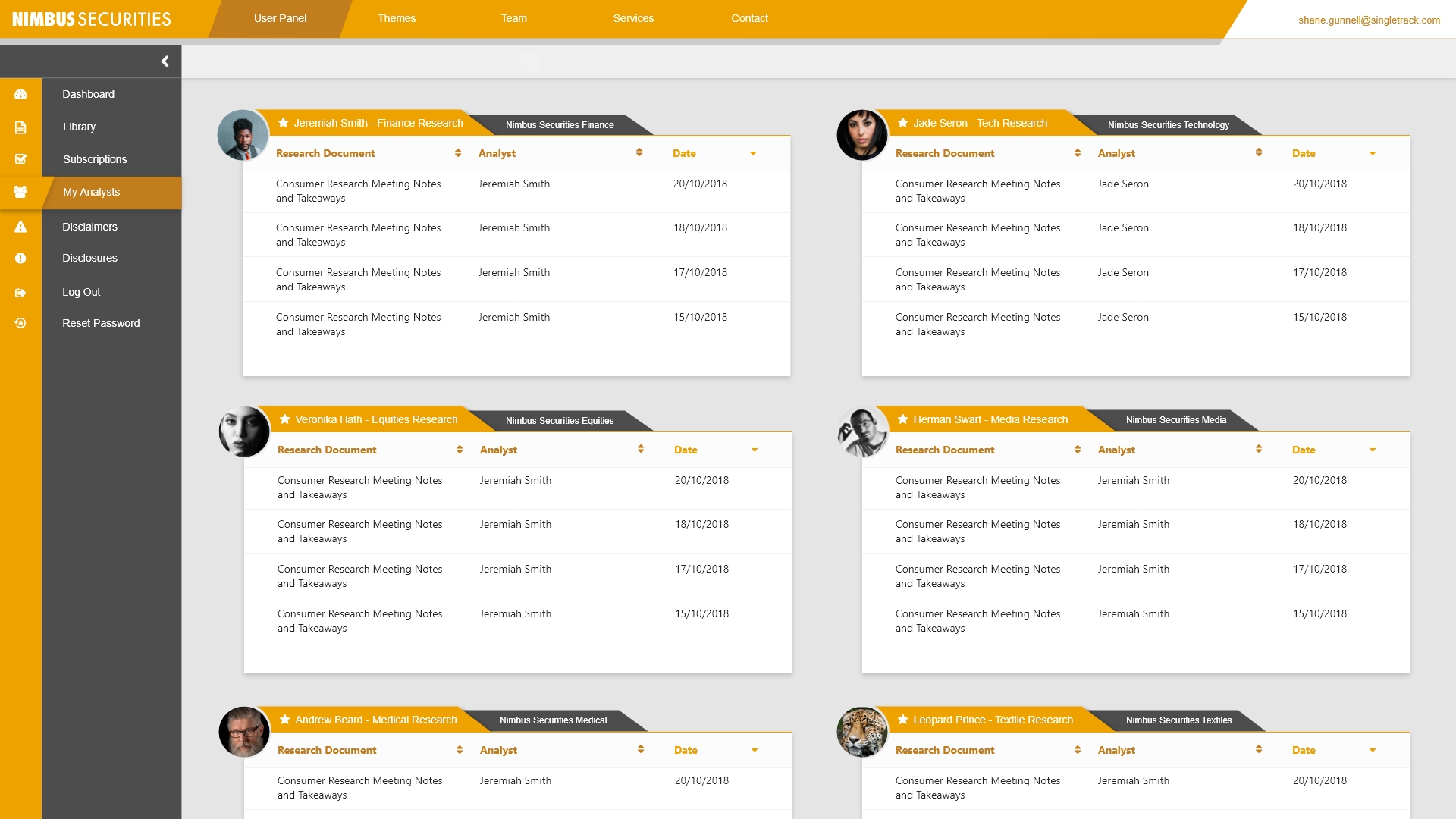
In this example there are only 2 navigation tabs for the portal - Dashboard, and Library. In clients examples of the portal, they can have upwards of 5-6 separate navigation items for their portal. This could be a list of subscriptions they have access too, another set of product dashboards and libraries, as well as anything newthey would like us to develop for them specifically.
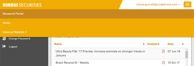
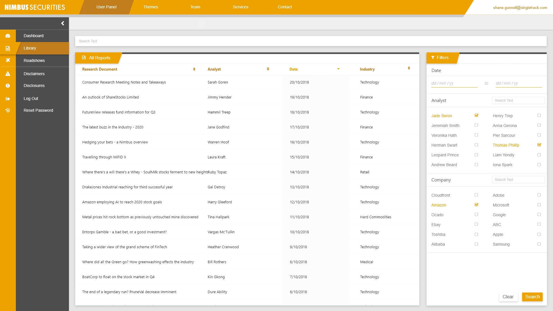
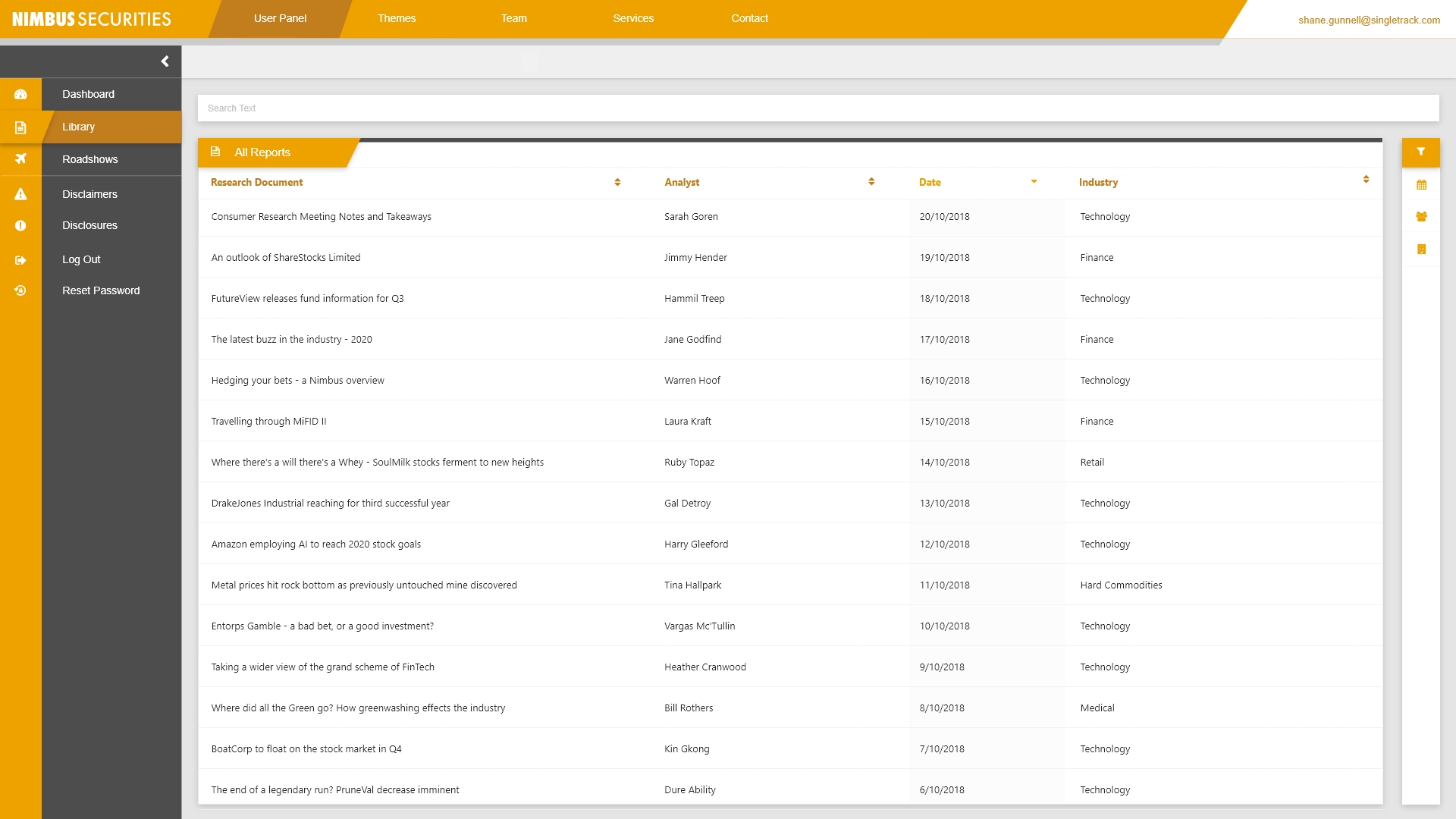
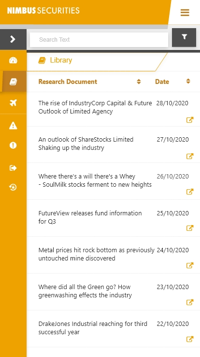
LIBRARY
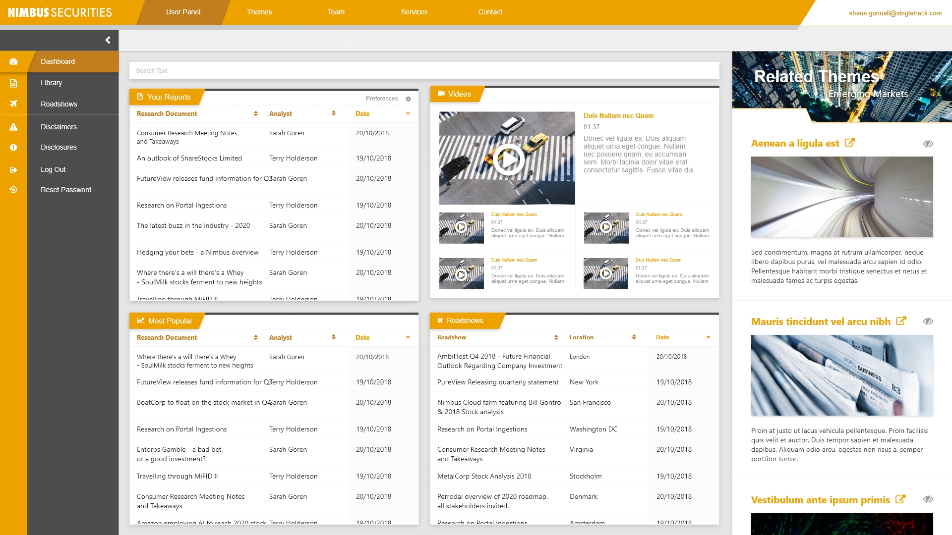
The entire product continues with the same design themes present in the Dashboard, as is visible here on the Library page. The functional difference between the Library and Dashboard is that the Library will show you everything you have available to view, whereas the Dashboard allows you to customise what exactly out of everything you’d like to see every time you log in.
Note: As these are base functionalities, they can be customised to the extent of the clients requirements.
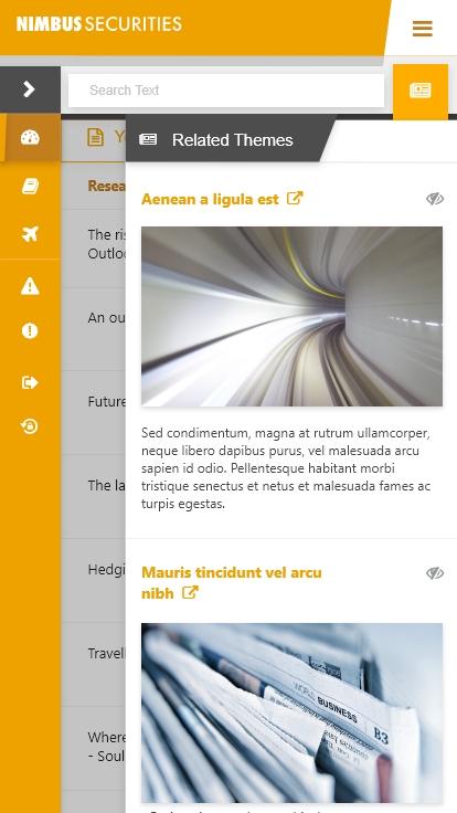
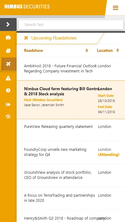
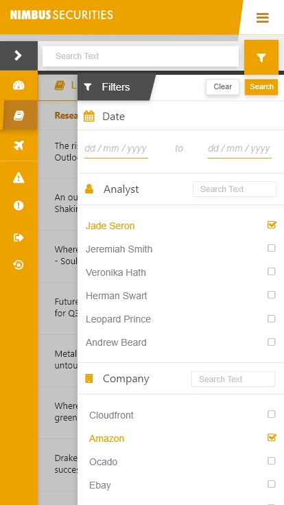
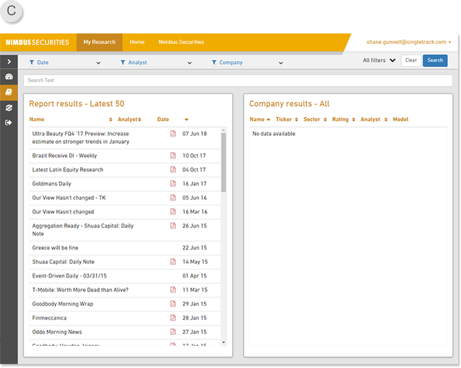
Library Image C) An example of how the product looks like when on Desktop.
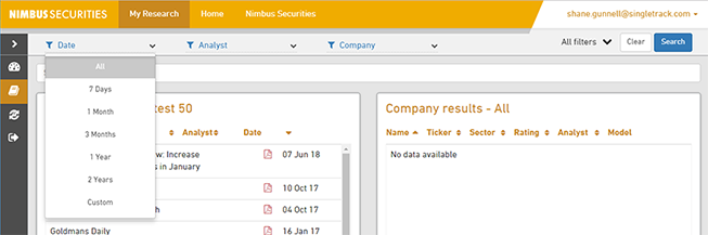
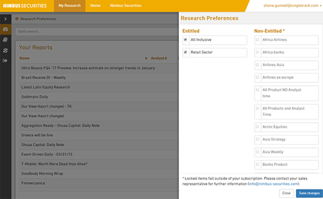
As you can see at the top of Library Image C, a variety of filters are available to best target what research you are searching for. These pills once clicked will reveal a drop-down of selectable parameters that would narrow down your search. Once you’ve selected as many as you’d like, pressing Search will affix a tag containing your search query to the document just below the search input box (This tag can be deleted at any time, or clicking clear removes the entire search criteria)
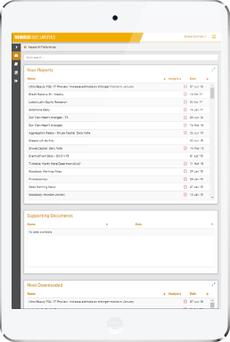
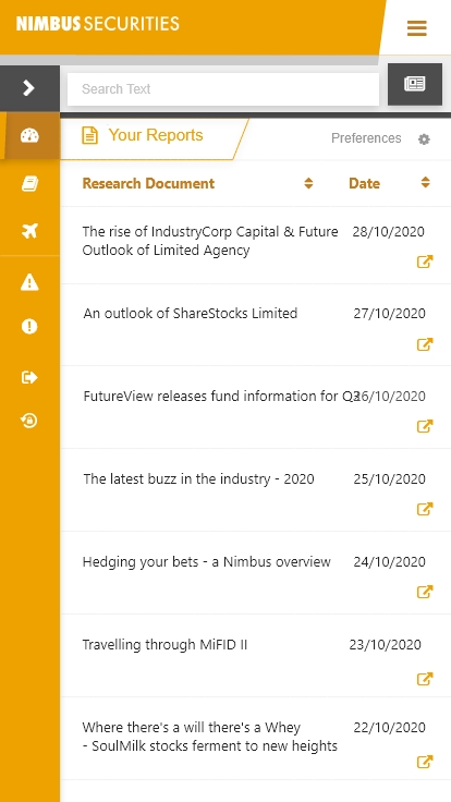
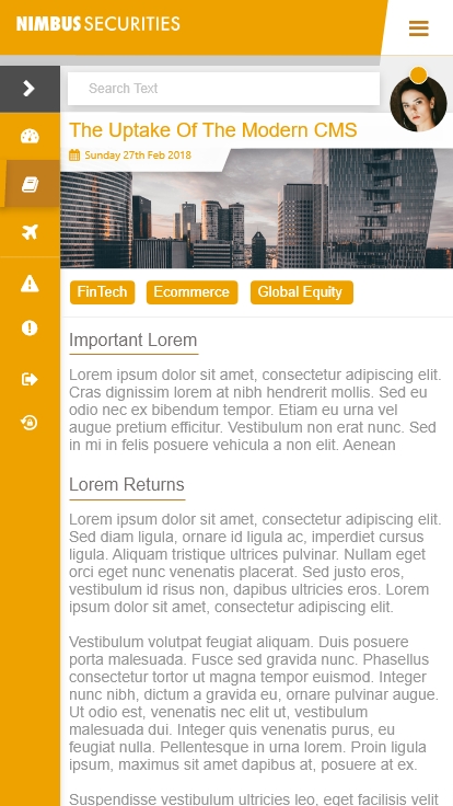
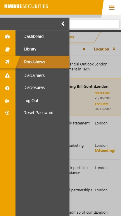
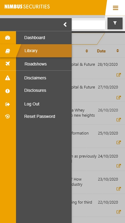
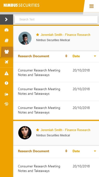
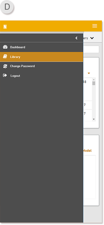
Library Image D) An example of how the product looks like when on Mobile.
When toggling the menu, an over-screen pop-out display will slide out from the left.This does overlap content, but not completely - this allows the user to still retain immersion into the current page they are on, but adds a navigation menu to continue their journey if they so wish.